Introduction ↓
Who we are.
We are the launchpad and growth partner to the new generation of clinic owners.
Part of our team used to build clinics inside the older clinic launching agencies in this space. They saw owners treated as transactions. So they left, to do it properly.
What we stand for ↓
Your growth and ours move together.
A quality of results this industry has never seen.
A family of clinic owners that want more and get after it together.
Where we're going ↓
F*** transactional, build relationships.
We want this to be more than financial success: a family of clinic owners that want more and get after it together.
We will bring an in-person element to telehealth by hosting clinic growth masterminds starting in mid 2027, for clinic owners to come together and to win together.
Logo ↓
Built, not generated.
The mark is a ramp with a clinic launched off it. Every part of it is calculated: the curve, the angle it leaves at, and the size of the dot.
The calculations ↓
51.84°
The launch angle.
The dot leaves the ramp at the angle of the faces of the Great Pyramid of Giza: 280 cubits high over a half base of 220. Rise 14, run 11. Built to last, imprinted in history.
4.48×
The compounding curve.
The ramp is a true compounding curve with a growth rate of 1.5. It starts at 15.85° and ends 4.48 times steeper, because results compound over time.
625 = 625
Equal areas.
The area under the curve is 625 square units. The dot has a radius of 14.11, which makes its area 625 too. Our work and your clinic, in equal measure of size and importance.
On the line
The launch.
The centre of the dot sits exactly on the line the curve launches it along. The ramp sets the direction, and the clinic keeps climbing.
Versions ↓
Rules ↓
Colour ↓
Ink and one red.
Block colour, never gradients. Everything that is read is black or white. Red makes one thing pop. Blue appears only as a soft glow behind a video.
Accent colours ↓
Accents never carry text. Blue lives in the background only: the glow behind a video and the corner texture.
Bright red is for the ring on a video play button and nothing else. Text greys: #1A1A1A for body copy, #4A4A4A inside cards, #6B6B6B for captions. In dark mode the page is #0C0C0F and cards are #1E1E1E.
Features ↓
Six signature moves. Each one uses colour to make a single thing stand out.
Your clinic.
The headline box.
A black block behind the key word of a headline. It turns white in dark mode.
Who we are.
The red phrase.
One word or phrase per title in red. One or two red touches per screen, no more.
The pulsing button.
One red pill per page, always pulsing. It is the only red block on the page.
The video glow.
The only gradient in the brand: a soft blue glow behind the main video on a page.
The corner texture.
Very small logos in blue, in the top corners only. Plain white wherever there is text.
Your growth and ours move together.
The red border.
A thin red border marks a belief card. The border never moves or shines.
Red sections ↓
A section can turn fully red. When it does, everything on it turns white: the text, the logo and its dot.
Red turns the volume up.
Use it for the one moment on a page that has to land. Nothing on red is black, and the red button never sits on it.
Typography ↓
One typeface.
Plus Jakarta Sans, in weights 400 to 800. Sentence case everywhere, and titles end with a full stop.
Imagery ↓
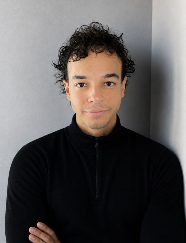
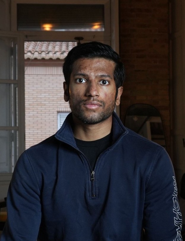
Real people only.
No stock models and no generated faces. If a person appears in our work, they are real: our team, our clinic owners, real creators.

Language ↓
How we sound.
Assertive, direct and refreshing. With passion towards takeover.
Staple lines ↓
The short lines we repeat word for word, everywhere.
launchaclinic.com is where clinic owners are born.
Your growth and ours move together.
F*** transactional, build relationships.
A family of clinic owners that want more and get after it together.
Narrative threads ↓
Six stories. Everything we publish ties back to one of them.
1. Where clinic owners are born.
People arrive with an idea and leave as owners of a running clinic.
2. The insiders who left.
Our team built clinics inside the older clinic launching agencies, and saw how transactional and flawed their model was, so we left to do it properly.
3. Partners, not transactions.
Our growth moves with theirs, and we guide and educate along the way.
4. Community.
Building a family of owners who want more and get after it together through in-person clinic growth mastermind events.
Our words ↓
The name is always written launchaclinic.com, lower case with the .com, even at the start of a sentence.
Voice and tone ↓
Assertive, direct and refreshing. With passion towards takeover.
Confident and on the owner's side. Big ambition, small company honesty.
- Talk to one person. "You" and "your clinic".
- Write it the way you would speak it.
launchaclinic.com is where clinic owners are born.